
Challenge: They have no app, and the two websites are for pre-order and online store.
Solution: To create a unified place for the store to sell pre-orders and
in-stock items.
in-stock items.
My Role:
UX designer designing an app for Filbar’s from conception to delivery.
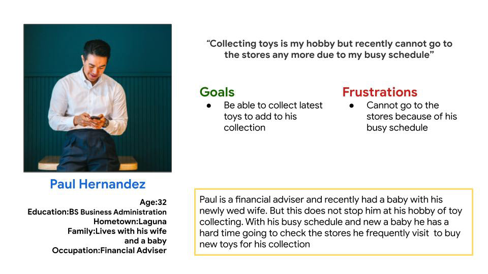
Target Audience
I conducted interviews and created empathy maps to understand the users I was designing for and their needs. A primary user group identified through research was working adults who love toys but cannot visit the store due to busy schedule
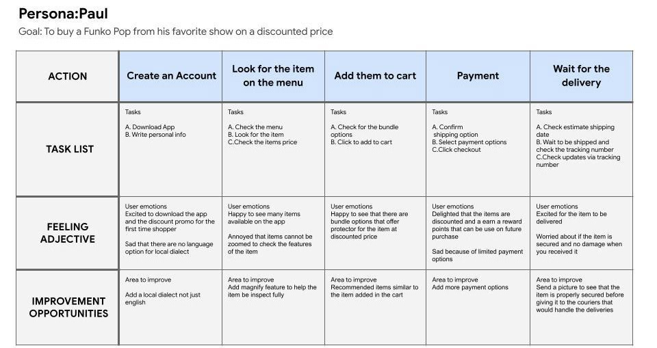
User Journey Map
Mapping Paul’s user journey revealed how helpful it would be for users to have access to a unified Filbar app.
This user group confirmed initial assumptions about Filbar’s customers, but research also revealed that time was not the only factor limiting users from using the two different websites. Other user problems included distance from the stores' branches, especially those in the province.
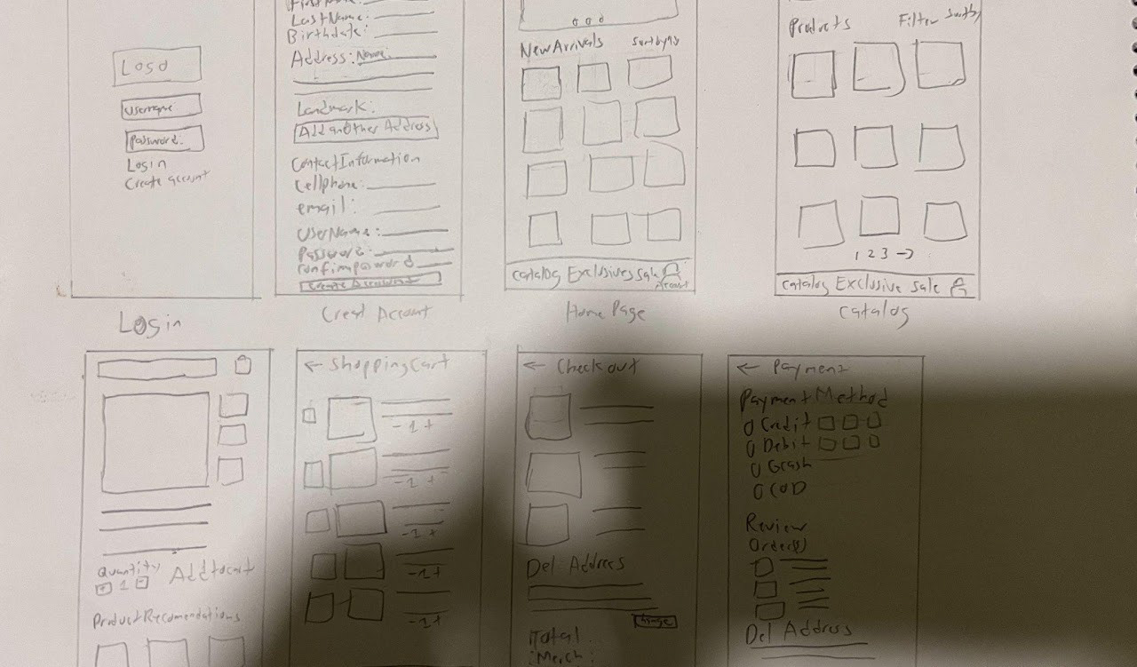
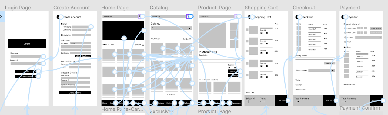
Paper Wireframes
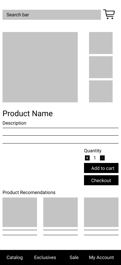
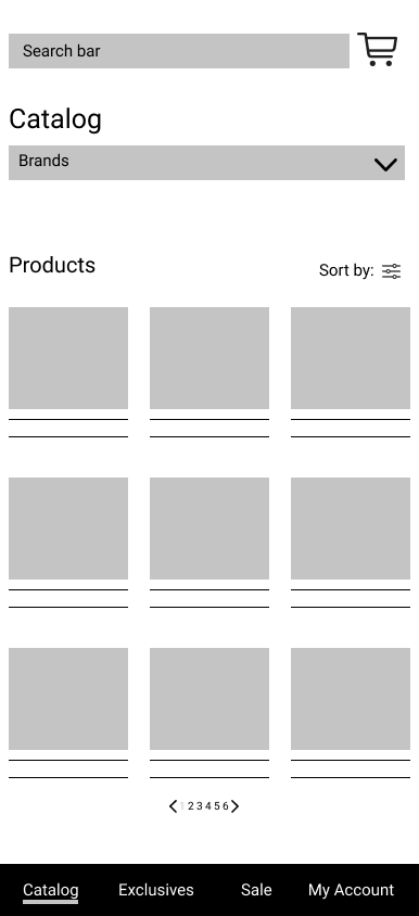
Taking the time to draft iterations of each screen of the app on paper ensured that the elements that made it to digital wireframes would be well-suited to address user pain points. For the home screen, I prioritized a column selection for items to help users save time.
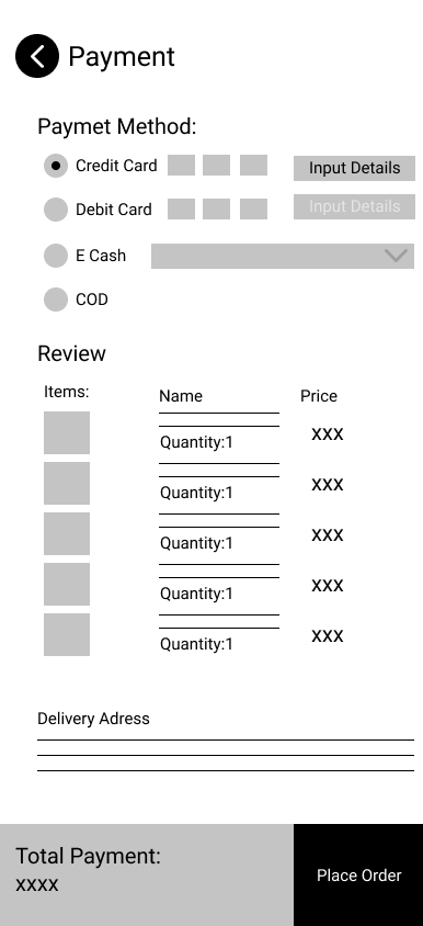
Digital Wireframes
Taking the time to draft iterations of each app screen on paper ensured that the elements that made it to digital wireframes would be well-suited to address user pain points. For the home screen, I prioritized a column selection for items to help users save time.
Low Fidelity Prototype (Preview)

Usability Study: Findings
I conducted two rounds of usability studies. Findings from the first study helped guide the designs from wireframes to mockups. The second study used a high-fidelity prototype and revealed what aspects of the mockups needed refining.
Round 1
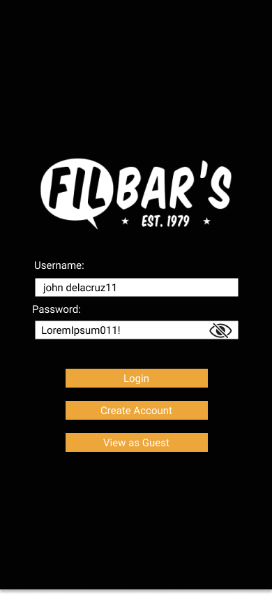
-Users want to view the password they input.
Round 1
-Users want to view the password they input.
-Users want to view the home page as guests.
Round 2
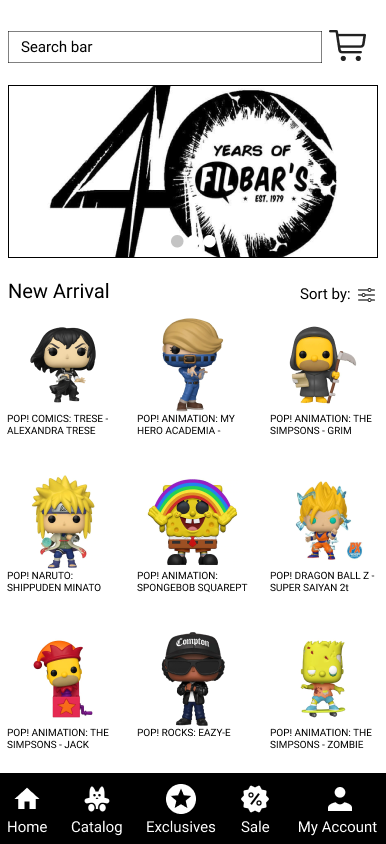
Users wanted icons, not just text on the menu on the bottom to identify faster what are the menus.
Round 2
Users wanted icons, not just text on the menu on the bottom to identify faster what are the menus.
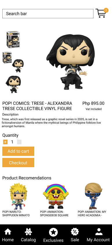
Mockups
-Added guest option on the Login screen. Also made the login button bigger.
-Added icons on the menu and clean the spacings between the items.
-Added icons on the menu and clean the spacings between the items.
What I learned:
While designing Filbar’s app, I learned that the first ideas for the app can be improved along the way. Usability studies and feedback are a good way to influence each iteration of the app’s designs.
Next steps:
Next steps:
Conduct another round of usability studies to check and validate if the pain points users experienced have been
addressed and fixed.
Conduct more user research to determine any new areas of need. Specifically the design for tracking and the catalog page
addressed and fixed.
Conduct more user research to determine any new areas of need. Specifically the design for tracking and the catalog page

